Student Job: Graph Visualiziation Tool
- C++
- Qt
- Doxygen
Simultaneously to my final thesis I implemented an application to visualize dynamic weighted and directed graphs with hierarchical organization of nodes at the VISUS (University of Stuttgart Visualisation Research Centre).
Here is an example of such a visualization for a soccer dataset. It is showing the number of goals countries playing against each other scored:
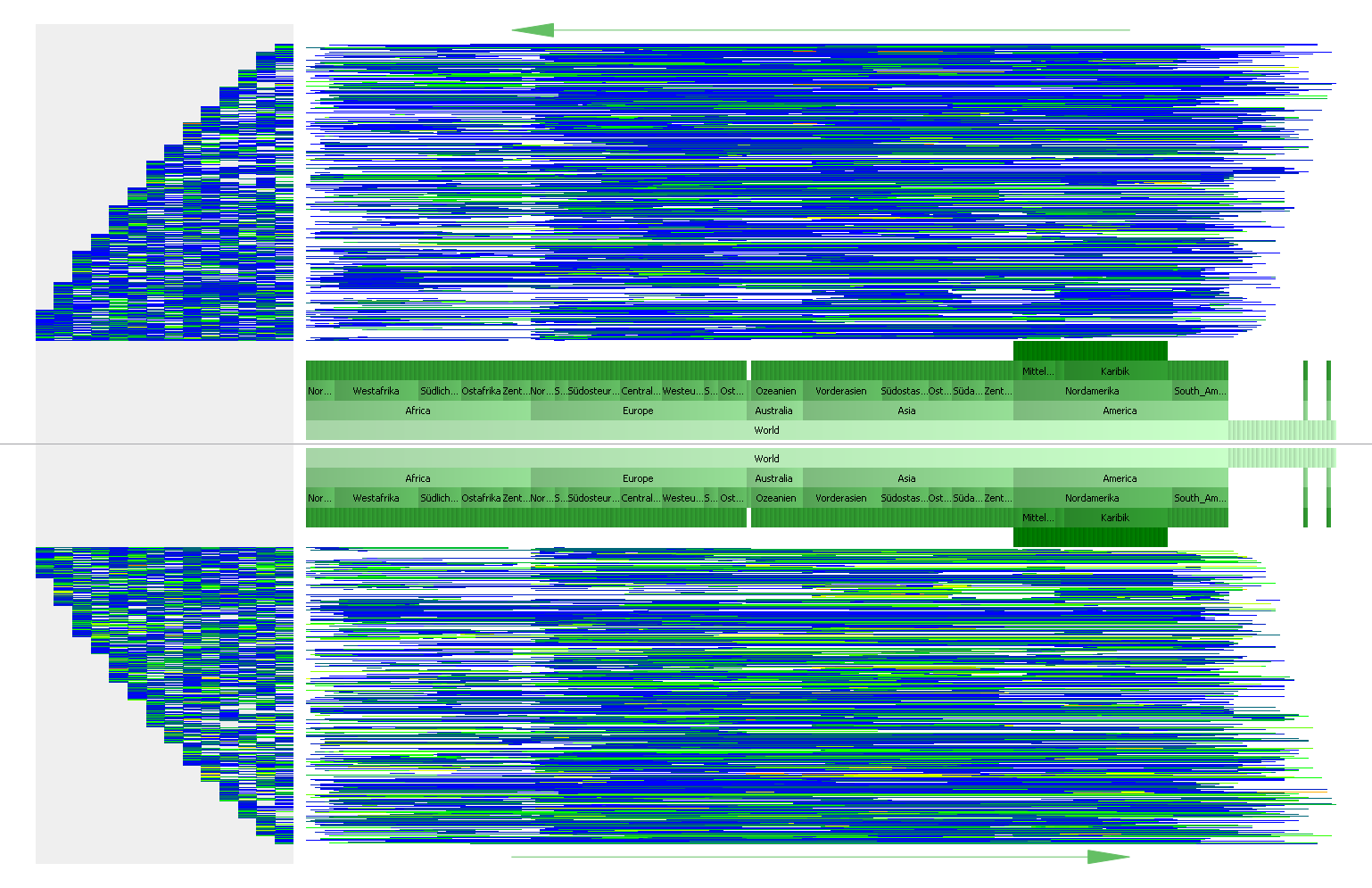
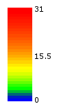
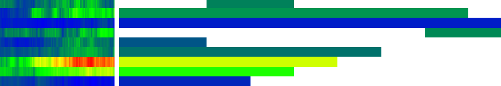
This visualization technique contains a hierarchy in the middle of the view which contains nodes of the graph; above and below, directed edges connecting these nodes are visible. Lines above the hierarchy represent directed edges from the node below the right end of a line to the one below the left end - this means that these edges run from right to left. Below the hierarchy, edges from left to right are visible respectively. On the left side of the visualization there is a time line showing color coded weights for edges placed at the same height. It is possible to select graphs (a time period) for coloring the edges in the right part of the visualization. The edges can visualize for example the minimum, the maximum or the average of weights of all selected graphs. Using tooltips and selection of different elements in the visualization more details with regard to the dataset can be analyzed.
Considering the soccer dataset the world (with continents, countries, ...) is represented as a hierarchy. All leaf nodes of the hierarchy (countries) are the nodes of the graph that are connected by directed edges. A directed edge between country A and country B means that country A played soccer against country B. The weight represents the number of goals country A scored against country B. In the time line the number of goals over time are visible. The edges can be colored for a selected time period (graphs) showing for example the average number of goals.
The program is implemented in C++ using Qt for the user interface; the Qt Graphics View Framework is used for the graphic and interactive elements of the visualization.
Using two different datasets, this video shows the application in action:
Visualizations I created with my application are used in the publication Edge-Stacked Timelines for Visualizing Dynamic Weighted Digraph. In there, a more detailed description of the visualization technique can be found.